Long Term Network Variance Analysis
Reviewing more than a decade of data
It is possible to perform the same analysis we use for most formal events on larger amounts of data, without regard to any particular events. This can even be done for the full database of more than a decade of data. This allows asking a different kind of question, namely, whether there might be any trends over time. One possible application for such analysis might be to determine whether a correction might be appropriate for analysis of the individual events, assuming there is a background trend. (A tiny correction can be generated but it is not consequential.) A more interesting question is whether there might be a reason
for any long lasting, consistent deviation in our standard measure.
While we cannot easily identify explanations for them, it is possible not only to see trends, but to test them for statistical significance. Obviously, if there are slight, but statistically unimpressive deviations, there is no need to scratch our heads seeking their meaning. On the other hand, if the evidence for long term trends is clear, they become interesting and justify some effort to understand what they might mean.
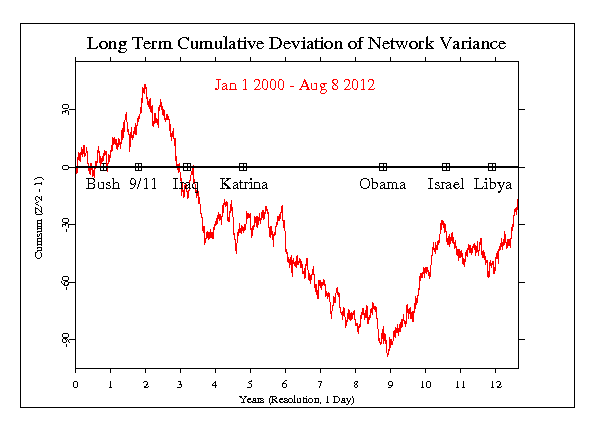
The figure below shows the period from January 1, 2000 to August 8, 2012, almost 13 years of data processed in the same way we analyse most individual formal events. The latter are typically a few hours long (6 hours is the most frequent length). We are here looking at almost 2 orders of magnitude more data. It is not selected to represent any particular moments, but is literally a look at the long history of all data collected by the GCP. The calculation is the squared Stouffer’s Z-score across all eggs each second, which we refer to as the network variance. The plotted line is the cumulative sum of this measure. Its expectation is a horizontal random walk.

The figure definitely shows long trends of consistent deviation. From the end of 2001, the network variance tends to be low until near the end of 2008. This persistent downward trend looks impressive, and an analysis by Peter Bancel showed that it is statistically significant. (He tested the parameters of a fitted curve.) The trend reverses in late 2008 and has an even more extreme slope for the next couple of years, then returns to what looks like the expected random variation for such data.
Some points are marked on the horizontal zero line which are the dates of a selection of events that were subjects of formal analysis. Some of these appear to correspond to inflections in the network data trace, but this is likely to be just coincidence. Individual events are unlikely to have such long lasting effects. There is, however, one clear parallel that can be drawn. The two major trends in this 12 year figure correspond largely to the US presidential tenures of George Bush and Barack Obama. Looking for sociological variables that might correlate with GCP data, Bancel collected US presidential favorability ratings. He found some 500 data points over 8 years and in exploratory analysis discovered a substantial correspondence. Again, we should not conclude there is a causal relationship, but the coincidence does symbolize a worldwide perspective on the US presence in global affairs.
AN UPDATE:
It is now January 5 2022, and an update is in order. I happen to be listening to Attorney General Merrick Garland talking about January 6 2021. He is part of the current manifestation of US Government, which is trying to make some order in the shitstorm of our current society. I'm in Princeton, which is an island of reasonable behavior, in a sea of confusion about what is real and worthy of tea and sympathy. There has been a lot of activity in the world over the past 8 or 10 years, and it is worth an updated graph of the primary measure's cumulative deviation from expectation.
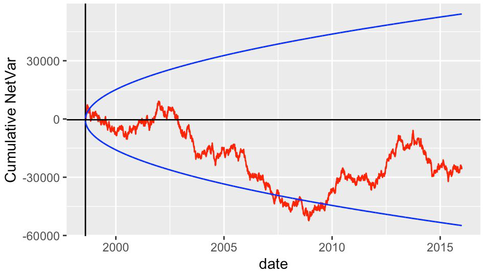
First we will look at the long term trends over the period of the GCP Formal Experiment, with 500 events, extending from Aug 1998 to the end of December 2015.

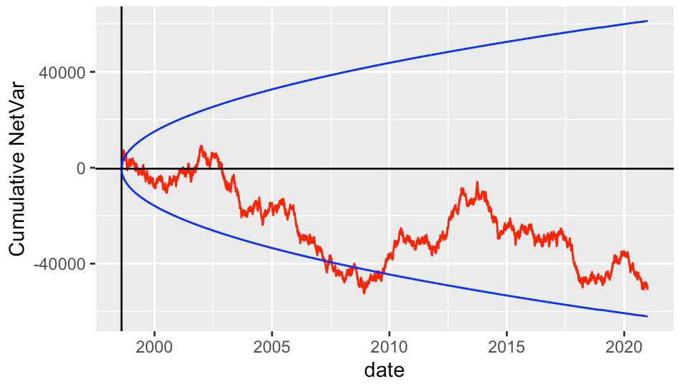
The next figure shows the whole history of the GCP network variance up to January 2022 as a long term graph. The measure is the same as for the events we assess, but continuous over all days, months, years of the Project. Looking at the history of GCP data we can consider how it might parallel some aspect of our history, the societal history on this planet. We can think about what the notable long trends might represent. Perhaps there is correlation with human or cosmic variables. We are at the beginning of a potentially very interesting search. For meaning, perhaps, and understanding, and implication.

We are interested to discover, if we can, what might correlate with the trends we see in these longtern graphs. There is a fair case to be made for sociological variables like poll data to be correlated. Stock market numbers seem to be linked somehow to GCP numbers (Ulf Holmberg), and there is potentially useful connection to near-planetary fields (Hans Wendt). We have only begun to look analytically at these variables.` Though it is only visual, a comparison of this long term GCP data trend with the variation in sunspot counts over the same time period shows what appears to be a substantial correlation between the GCP Netvar measure and Solar Cycle counts.
It is important to keep in mind that we have only a tiny statistical effect, so that it is always hard to distinguish signal from noise. This means that everysuccessmight be largely driven by chance, and every
nullmight include a real signal overwhelmed by noise. In the long run, a real effect can be identified only by patiently accumulating replications of similar analyses.
A separate analysis of odds-ratio spikes in the long term data presents another interesting view of the full database.