|
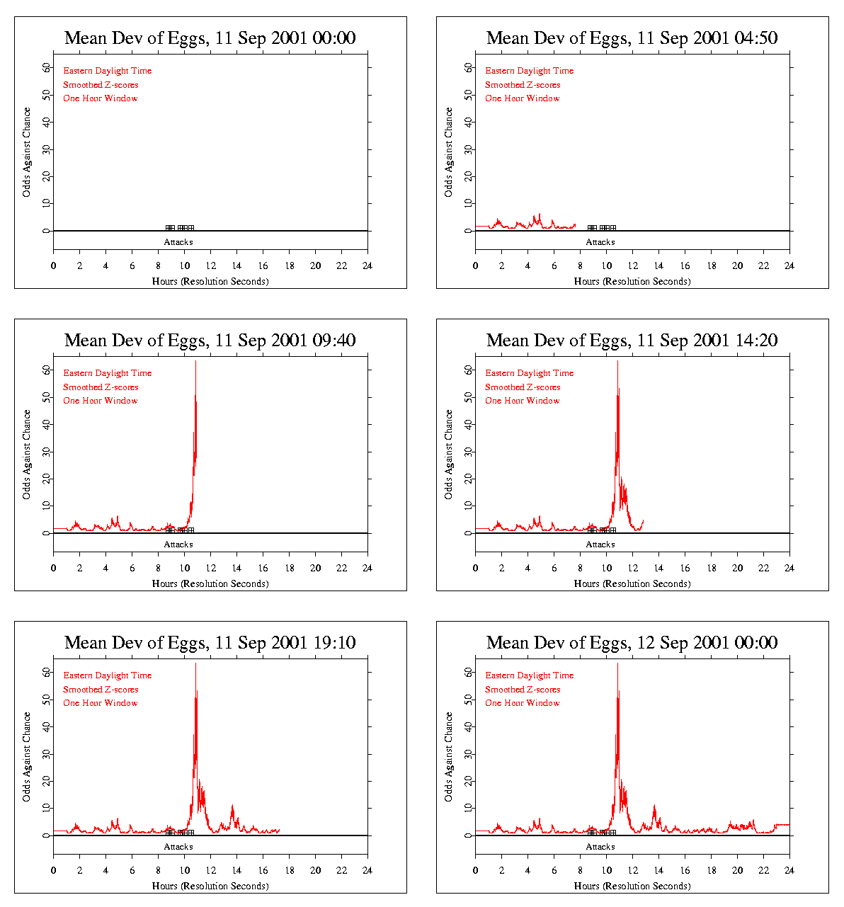
On the level of the second-by-second composite means across eggs,
there is unusual clustering on
September 11 2001, which can be visualized by smoothing the data using a
"moving average". This graph shows the odds against chance for the raw
data, using a smoothing window of one hour,
which is stepped second-by-second through the full 24 hours.
(Note: the clock showing progress is not correctly synchronized, but the
x-axis labeling is correct.)
The animated figure is drawn from the resulting sequence of
points, each of which is the mean of one hour of data.
It emphasizes the periods of time when the raw data tends on
average to stand out from the random background.
The version in place has timing set to show the 24-hour period in 15 or 20
seconds. But the display will be constrained by the speed of your processor.
Use your browser's back and forward buttons to replay.
Author: Greg Nelson, 19 Sept 2003

|